Introduction
The Nokia Lumia 1520 is just like the rest of the premium Lumia smartphones we've seen, but bigger and faster. The advanced imaging and the custom app selection by Nokia will make the difference against Android phablets, with the Snapdragon 800 making sure the Finn won't feel outgunned. Sounds like a promise for the best experience yet on Windows Phone.A few months ago Nokia was in the headlines for what seemed the wrongest of reasons to people who fondly remembered the Finns from their glory days. Voices were rising once again above the lamenting choir, about what might have been had Nokia gone with Android instead.
Oh well, we're well past the what-ifs and should-haves. And no, it's not because Microsoft's check has already been written. Nokia's first phabet has crossed into what was, until now, a strictly Android territory. And not just average droids either, but some of the biggest, meanest species of Android we have seen.


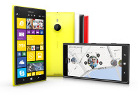
Nokia Lumia 1520 official photos
The Nokia Lumia 1520 didn't just tip-toe in, looking over its shoulder. Armed with a PureView camera, a 1080p display and a quad-core Snapdragon 800, the Finnish giant entered with a bang!
The latest GDR3 version of Windows Phone finally has support for quad-core Krait processors and Full HD displays. There's an attempt too, to make better use of the size and resolution by adding an extra column of contents across the interface. It was about time Microsoft brought the platform back in the hardware race and we are delighted to finally meet the first Windows Phone to aim for the pole position.
Key features
- Quad-band GSM/GPRS/EDGE support
- Quad-band 3G with 42 Mbps HSDPA and 5.7 Mbps HSUPA support
- Penta-band LTE Cat4 support, 150Mbps downlink, 50Mbps uplink
- 6.0" 16M-color ClearBlack IPS CLD capacitive touchscreen of 1920 x 1080 pixels; Corning Gorilla Glass 2; Nokia Glance
- 20MP PureView sensor (15MP effective), 1/2.5" sensor size, ZEISS lens, Optical Image Stabilization, dual-LED flash
- 1080p@30fps video recording; 2x lossless digital zoom
- 1.3MP front-facing camera
- Windows Phone 8 GDR3 OS with Nokia Black
- 2.2GHz quad-core Krait 400 CPU, Adreno 330 GPU, Qualcomm Snapdragon 800 chipset, 2GB of RAM
- Wi-Fi 802.11 a/b/g/n/ac, dual-band
- GPS receiver with A-GPS and GLONASS support
- Free lifetime worldwide voice-guided navigation
- 32GB of inbuilt storage
- microSD card slot, up to 64GB
- Active noise cancellation with a dedicated mic
- Wireless charging with optional accessories
- Built-in accelerometer, gyroscope and proximity sensor
- Standard 3.5 mm audio jack
- microUSB port
- Bluetooth v4.0 with A2DP and file transfers
- SNS integration
- Xbox Live integration and Xbox management
- NFC support
- Digital compass
- Nokia Music
- FM radio
Main disadvantages
- Screen has average sunlight legibility
- Non-user-replaceable battery
- No system-wide file manager
- No lockscreen shortcuts
Nokia's Lumia Black update isn't bringing as many new features as Amber, while the GDR3 version mostly makes sure the OS would happily accommodate the new chipset and screen resolution. Users will perhaps have to wait for the 8.1 update for a notification center (hopefully) and a file manager (not too likely) among other things.
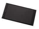
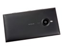
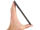
Nokia Lumia 1520 lice photos
Yup, the Lumia 1520 sounds just like what the doctor ordered for the ailing Nokia cellphone business. It makes us sad that they've decided to scrap any future effort altogether, but that doesn't mean it won't be closing the show with a bang. We may be well into their farewell season, but the finale is not close. It's too early to write Nokia off just yet - what we have ahead seems like the climax of its work. And the hardware inspection of one of their finest specimens is just a click away. So, shall we?
Unboxing the Nokia Lumia 1520
The Nokia Lumia 1520's retail package is the standard blue box that has become a signature feature of the Lumia line. Other than that you get the standard set of accessories: a charger with a detachable microUSB cable, a SIM ejector tool, some printed manuals and a single-piece headset of in-ear design.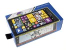
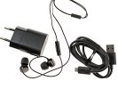
The Lumia 1520 in Nokia's recognizable box • box contents
360-degree spin
The Nokia Lumia 1520 is, inevitably, a large slab, the 6" screen alone is huge for a pocketable device. At 162.8 x 85.4 x 8.7mm, it's actually reasonably sized for a phablet. Its weight however is not, the Lumia 1520 weighs good 209g, which is almost the same as the aluminum-clad 5.9-inch HTC One Max (217g), which even has a wider footprint and a thicker profile going against it.Design and handling
The Lumia design has been pretty much set in stone but not without some variations. The Nokia Lumia 1520 is actually very similar to the Lumia 925. The difference to the Lumia 1020, for instance, is that the top and bottom edges are rounded rather than flat. Other than that, the rectangular look and beveled sides are an unmistakable trait of the Lumia line since its inception.

Familiar Lumia design
Phablets are pushing the limits of what can be considered pocketable and comfortable for one-handed use. That said, the Lumia 1520 is not the biggest around - as we said, the HTC One Max is a tad taller and heavier, while the Samsung Galaxy Mega 6.3 is tangibly bigger.
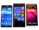
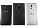
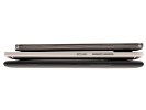
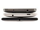
Size comparison: Samsung Galaxy Note 3, Nokia Lumia 1520, HTC One Max
Those have some software features to help with one-handed use tough, which mostly amount to squishing keyboards (i.e. the on-screen QWERTY and the dialer) in the corner so you can reach buttons with your thumb. Windows Phone lacks such options and the Lumia 1520's large screen will have people permanently constrained to two-thumb typing.
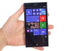

The Lumia 1520 feels big in the hand
The phablet maintains the capacitive Back, Home and Search buttons just like other phablets (One Max, Galaxy Note 3 and Galaxy Mega 6.3). Above the screen is a 1.2MP/720p front-facing camera along with an array of sensors. The front of the phablet is almost entirely coated with Gorilla Glass 2, which covers the screen, the capacitive keys and front camera.
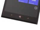
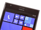
Capacitive keys below the screen • front-facing camera and sensors above the screen
The basic layout of the other hardware controls is unchanged - all the buttons are on the right side, starting with the volume rocker on top, the power key and finally the two stage shutter key. Those keys have been moved down so they are easy to reach with your thumb (though volume up is a bit of a stretch).
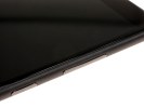
Hardware keys on the right side
The left side of the Lumia 1520 holds the nanoSIM card compartment and the microSD card slot. Those have to be opened with a dedicated tool, which might be a hindrance if you swap memory cards often. Still, we're always glad to see expandable storage, especially on devices with high resolution screens and high megapixel cameras.
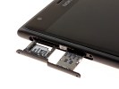
nanoSIM and microSD card slots on the left
The bottom of the phablet features a regular microUSB 2.0 port, while the 3.5mm audio jack is smack in the middle on top.
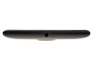
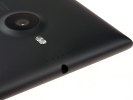
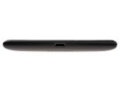
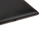
3.5mm audio jack • microUSB 2.0 port
It's the back of the Nokia Lumia 1520 that's quite interesting. The 20MP PureView camera with ZEISS lens and optical image stabilization protrudes slightly from the back, but less so than the Lumia 1020's camera. Keep in mind that the 1520 is 1.7mm thinner than the 1020 too, using a smaller sensor has really helped Nokia keep that unsightly hump in check.

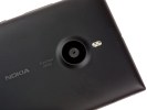
The back of the Nokia Lumia 1520 • PureView camera with ZEISS lens and dual-LED flash
Aside from the sensor size - a smaller 1/2.5" vs. a bigger 1/1.5" - there has been another concession made, there is no xenon flash but a dual-LED light instead. Still, the sensor is relatively big (around 45% bigger than the common 1/3" sensors), which combined with OIS should still make for some great low-light shots.
The Nokia Lumia 1520 phablet has a whopping four microphones, a pair on the front and another two on the back. At the front, there's one below the screen and one near the earpiece. On the back, there's one above the LED and one inside the loudspeaker grille. The mics in each pair are sufficiently wide apart, so you can expect great stereo sound capture from both the back and the front camera. The mics also include Nokia's proprietary HDR tech and Bass filter option and also allow for noise suppression of ambient noise when for instance, you are recording a person talking in front of the camera.
Battery life
The battery in the Lumia 1520 is sealed, but it has the reasonably big capacity of 3,400mAh. The phablet comes with built-in wireless charging, a feature that was missing in the 1020. To make use of it however, you would have to buy separately a Qi wireless charger - these days those come in many shapes and sizes.The massive battery, light-weight Windows Phone OS and power-efficient display were made to count in video-playback and web browsing test. They surely helped the Lumia 1520 achieve an amazing score despite the huge estate to light up. Talk time and the overall stand-by endurance are great too thus the 107h top-notch rating is no surprising.
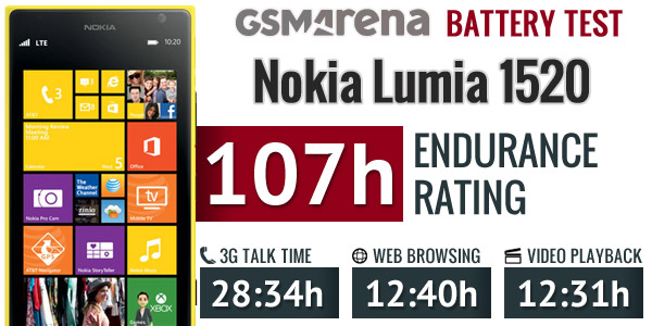
Anyway, with an overall rating of 107 hours, the Lumia 1520 is well ahead of the other phablets we've tested so far. What this number means is that the Lumia 1520 should manage four and a half days on a single charge if used for one hour each of calls, web browsing and video playback daily.
Display
The Nokia Lumia 1520 has a 6" IPS LCD screen of 1080p resolution, the pixel density works out to 367ppi. The LCD incorporates Nokia's ClearBlack tech - a set of polarizing filters, which minimize glare. Plus, Gorilla Glass 2 on top for protection.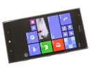

The 6" IPS LCD on the Lumia 1520
The capacitive touch sensor on the display features the supersensitive touch technology that allows it to detect fingers even through winter gloves.
The 1520 comes with the Lumia Color Profile option in the settings, which gives you two sliders to play with - one for color temperature (which spans the cool, neutral and warm range) and color saturation (natural to vivid).
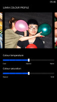
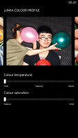
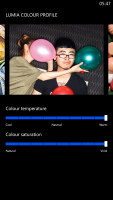
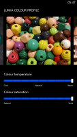
Lumia Color Profile settings
The Nokia Glance screen keeps the clock and notification counters visible even after you lock the screen. This could be set to appear only for a little while after you lock the screen, intermittently on and off and always on. There's a separate always on setting for when the device is charging. A Night mode allows you to pick a different color for the Glance screen info - Red, Green or Blue - if the default White setting is too bright for your sleepy eyes.
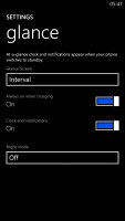
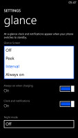
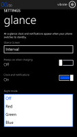
Nokia Glance Screen settings
One new option in GDR3 is the screen rotation lock. That's an important feature for a phablet, but unfortunately it's only accessible from the Settings menu, which means you have to leave the app you are using to change it, there are no quickly accessible toggles here (this is a common problem for any settings in Windows Phone).
As we already mentioned, the Lumia 1520 screen is tack sharp. Due to its large diagonal, pixel density drops below 400ppi, but 367ppi is still better than what most people's eyes can resolve, especially when you consider you tend to hold a phablet further away from your eyes than a phone.

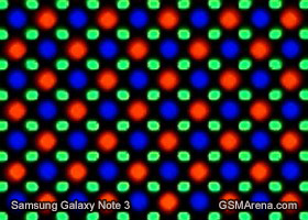
Nokia Lumia 1520 display matrix compared to the Samsung Galaxy Note 3
The viewing angles are excellently wide with only a minor shift in contrast when going to extremes. Color rendering is good and, as an added bonus, you can tweak the white balance and saturation to your liking. The one weak spot of the display is the black levels, which are not as great as on AMOLED, but the overall contrast is still quite good.
| Display test | 50% brightness | 100% brightness | ||||
| Black, cd/m2 | White, cd/m2 | Black, cd/m2 | White, cd/m2 | |||
| HTC One Max | 0.14 | 224 | 1591 | 0.40 | 629 | 1572 |
| Samsung Galaxy Note 3 | 0 | 149 | ∞ | 0 | 379 | ∞ |
| Sony Xperia Z1 | - | - | - | 0.38 | 580 | 1513 |
| Nokia Lumia 1520 | 0.22 | 263 | 1174 | 0.43 | 522 | 1207 |
| Nokia Lumia 1020 | 0 | 172 | ∞ | 0 | 398 | ∞ |
| Nokia Lumia 920 | - | - | - | 0.48 | 513 | 1065 |
| Sony Xperia Z Ultra | - | - | - | 0.47 | 467 | 1001 |
| Sony Xperia Z | - | - | - | 0.70 | 492 | 705 |
| Huawei Ascend Mate | 0.23 | 222 | 982 | 0.67 | 711 | 1053 |
| Samsung Galaxy Mega 6.3 | 0.12 | 160 | 1364 | 0.32 | 440 | 1379 |
| Samsung I9505 Galaxy S4 | 0 | 201 | ∞ | 0 | 404 | ∞ |
| HTC Butterfly S | 0.15 | 165 | 1117 | 0.43 | 451 | 1044 |
The ClearBlack tech does help minimize reflectivity. The relatively low brightness however hurt the outdoor performance.
User interface: GDR3 + Lumia Black
The Nokia Lumia 1520 comes with Windows Phone 8 GDR3 (the Lumia Black edition) out of the box. The Microsoft-issued GDR3 reelase and the Nokia-made Black enhancements add a handful of new features, but most importantly bring support for 1080p screens and the Snapdragon 800 chipset, without which the 1520 would've been impossible.That said, the user interface still feels very familiar if you are coming from another Windows Phone device. Yes, you can fit more Live Tiles per row on the homescreen (6 of the smallest ones, up from 4), but that turned out to be a function of the screen size rather than a Lumia Black specific feature. There are a couple of other changes, we'll get to those in a minute.
Here is a quick video to get you started:
A push on the unlock button or a double tap on the screen reveals the lockscreen, which displays the current time and date and shows calendar events, emails and missed calls. Pushing the volume rocker in either direction will bring the sound switch and music controls on top of the screen.
Swiping the lockscreen up unlocks the device or you can just press and hold the camera shutter key to unlock the phone and jump straight into the camera app.
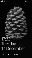
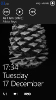
The lock screen • Music controls on the lockscreen
There's a reasonable level of flexibility and functionality to the lockscreen - the Live Apps service allows apps to display notifications and images. You can set one app to display big notifications ("detailed status") and up to five more apps to show a less detailed quick status. There are already apps in the Store that display the battery percentage on the lockscreen via those kind of notifications.
The lockscreen wallpaper can also be controlled by apps - you can let the music player replace the lockscreen image with the album art of the currently playing track, or let one of the installed apps choose the image (e.g. Bing's beautiful background images or photos from your Facebook account).
The Modern UI is a vertical grid of Live Tiles, which can be reordered any way you like. Almost anything can be pinned to the homescreen - apps, contacts, web pages and more. Unfortunately, the app launcher is still just an alphabetical list of all apps, no folders, no icon grid. We don't think it works too well on a 6" screen.
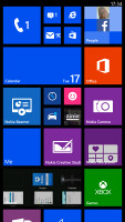
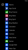
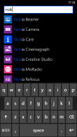
The home screen and main menu
Windows Phone 8 lets you resize the live tiles. Upon a tap and hold, you'll get an extra resize button, next to the unpin one. You can opt between quarter, normal and double size. If you select the smallest one though, the tile will be just a static icon (as is in the regular menu).
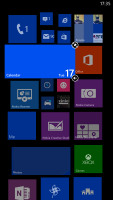
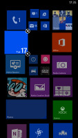
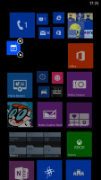
Resizing a tile
Most Live tiles display relevant info such as the current date, pending calendar events, missed calls, unread emails and more (third party apps do it too). The Marketplace tile displays the number of updates available, while the Pictures tile is essentially a slideshow of your photos. It's nice to have all that info always available at-a-glance. You can look at them as homescreen widgets of sorts.
WP8 can do multitasking, though not with the level of user control that Android allows. Apps not in the foreground are suspended, but the OS has ways to take over and carry out the task for them (e.g. continue playing music). If an app needs to run in the background (sat-nav clients, messengers, etc.) it can. Microsoft is expected to bring better multi-tasking with the Windows Phone 8.1 update.
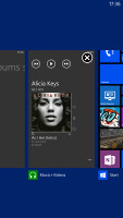
The multi-tasking interface
The new feature in GDR3 is that you can "close" apps by hitting the X button. It's not as comfortable as swiping apps away, but at least now you have control over the recent apps list.
Opening the settings menu displays two sets of options: like on the start screen, you can swipe between System and Applications. System covers all the settings you can think of like sounds, color theme, Wi-Fi, Bluetooth, Accounts, etc. The Application settings let you configure each app you have on the device.
We would've liked to see some kind of quick toggles in Windows Phone 8 to spare you the need to go all the way to the settings menu to enable Wi-Fi, Bluetooth, GPS and the likes. There's a new Screen rotation lock feature, but it requires you to exit the app, find it in the settings, enable it and then get back to the app. The same goes for all the other settings, it's just too many steps for such a common task.
There is one new setting as part of the GDR3 refresh - screen rotation, where you turn on/off the automatic UI rotation.
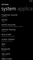
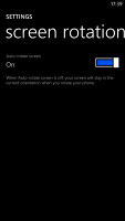
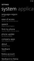
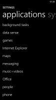
Windows Phone 8 settings menu
Another feature we feel is missing is a place where you can see all of your notifications from various apps. Live Tiles manage to show notifications from each app to some extent, but they don't really have enough room for things like e-mail subject and such, while Android and iOS notification areas do. Microsoft has confirmed working on just such a feature and that we should see it in a future update.
Android, for example, has a widget that shows you a list of emails complete with the subject and a line of the message body. You can scroll through that list and hit a specific message to read it. There are more examples of how widgets are more interactive than Live Tiles and while the difference is relatively minor on the small 4" screen of the Lumia 520, the setup feels limiting on the large, high-res screen of the Lumia 1520. Let's not even mention the split-screen multitasking and mini apps that are popular on 5+ inch devices and are certainly not present here.
The Lumia 1520 comes with the Data Sense app, which shows you the amount of data you've used. Both cellular and Wi-Fi traffic is accounted for. There are different data limit types: one-time, monthly and unlimited. The first two accept custom bandwidth limit values, while the latter is applicable if you have an unlimited data plan, but would still like to track your usage. With GDR3 there's an option to prevent data usage when roaming.
Data Sense can also restrict the background data usage for all apps, provided you're near a preset data limit. This will prevent some apps from functioning properly, though.
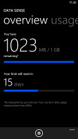
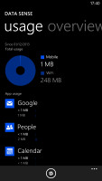
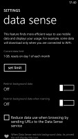
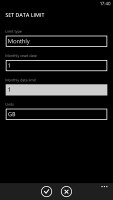
Data Sense is useful if you're on a limited data plan
Naturally, Nokia Lumia 1520 comes with a special feature for kids conveniently dubbed Kid's corner (HTC liked it well enough to put a similar feature on the One series). You can select the apps and the types of media content that goes in and password-protect it, so you can safely share your smartphone with your kids without worrying that they will mess up your settings or access inappropriate content. When activated, the Kids corner is accessible by swiping left off the lockscreen. If you've secured it, your kids won't be able to return to your standard lock and home screen without the password.
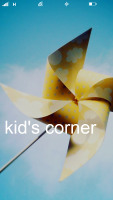
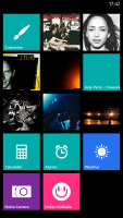
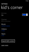
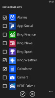
The Kid's corner
Driving Mode can be enabled automatically when the phablet connects to a specific Bluetooth device (i.e. your car's stereo). This mode mutes all notifications except calls and texts, but you can mute those too. If you do, you can set an automatic reply text.
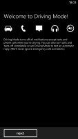
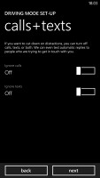
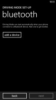
Driving mode
Microsoft is trying to appeal to business users too - a company can create its own Hub where employees can find news, calendars and other info relevant to their work. Companies can also create their own apps that only employees can install.
Being a WP8 handset, the Nokia Lumia 1520 also supports voice commands - you can dictate or have the phone read text out, you can initiate searches and so on. Unfortunately, the Windows assistant is still far behind the competition as far as recognition speed and accuracy are concerned. Microsoft is said to be working on a new virtual assistant dubbed Cortana, which should premiere with WP8.1 in US English in early 2014 and before the end of 2014 for the rest of the world (in 44 additional languages).
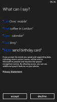
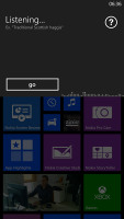
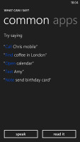
Microsoft Tell Me
No comments:
Post a Comment